")
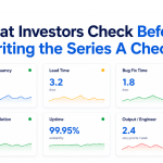
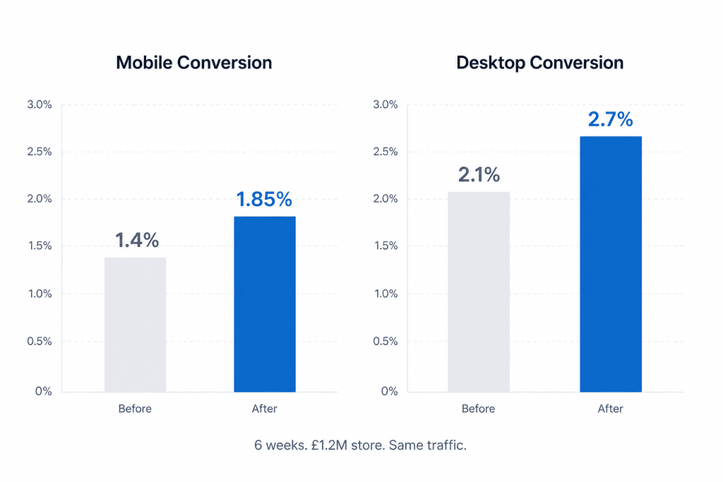
Shopify checkout optimization can often deliver larger conversion gains than increasing traffic. A UK direct-to-consumer fashion brand doing roughly £1.2M in annual revenue came to SynthWeb with a typical Ecom Sprint problem — traffic was strong, ad costs were rising, but checkout conversion had plateaued at 1.4% on mobile and 2.1% on desktop. Six weeks later, mobile conversion had moved to 1.85% and desktop to 2.7%. That is a 30%+ lift on the same traffic. This post walks through the seven specific fixes that drove the change, in priority order. Every one of them is replicable on any Shopify or WooCommerce store doing similar volume.
This Shopify checkout optimization case study shows how a series of small checkout improvements generated a significant conversion lift without increasing advertising spend.
We have intentionally not named the client because they are still trading and competitors read content like this. The numbers are real.
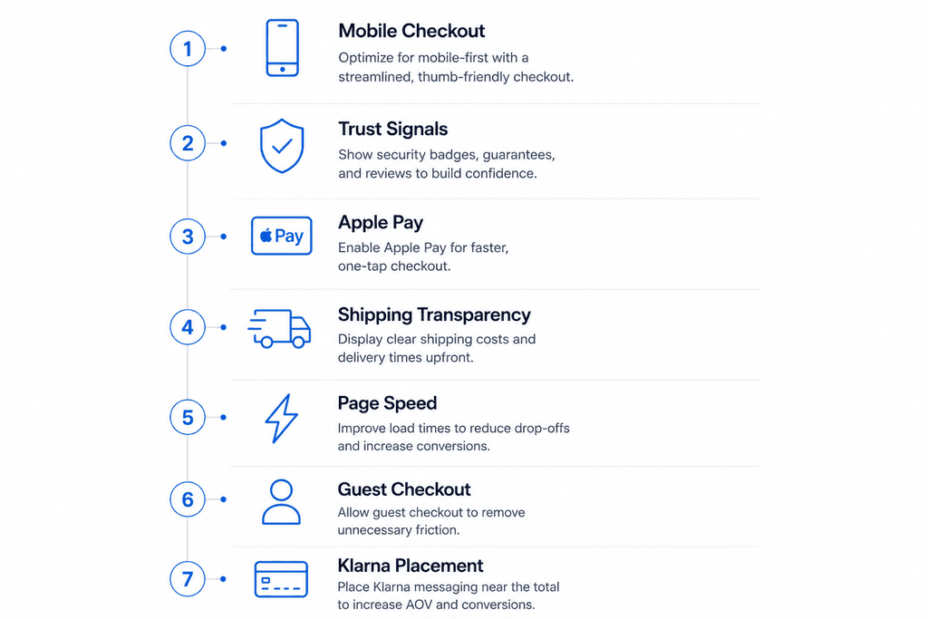
Fix 1 — Shopify Checkout Optimization– Mobile-first checkout flow rebuild
The store was running a desktop-first checkout that had been “made responsive” by the original theme developer two years prior. On mobile, fields were too small, form labels overlapped on iOS Safari, and the payment selector required a scroll-and-tap that broke when the soft keyboard opened. We rebuilt the mobile checkout from scratch using Shopify’s checkout extensibility, prioritising a single-column flow with autofill-friendly inputs and address autocomplete via the Google Places API. Mobile checkout completion went from 38% to 52% on its own.
Fix 2 — Trust signals at the right moment
The store had Trustpilot reviews on the homepage and product pages but nothing in the checkout flow. We added three trust signals in the right places: a “Free 30-day returns” line directly under the “Pay now” button, a small bank of payment method icons (Visa, Mastercard, Apple Pay, Klarna) above the email field, and a single 5-star review pulled from Trustpilot directly above the order summary. The hierarchy matters — these signals do not work if they live above the fold or in the header. They work at the precise moment of payment hesitation.
Fix 3 — Apple Pay and shop pay buttons above the form
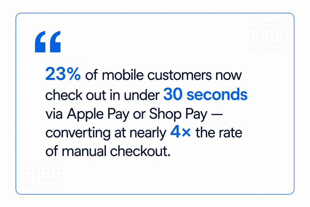
The original checkout buried Apple Pay below the manual address entry form. We moved Apple Pay and Shop Pay buttons to the top of the checkout, immediately under the cart summary, with a clear “Or check out manually” divider below. 23% of mobile customers now check out via Apple Pay or Shop Pay — completing in under 30 seconds. Buyers who choose those paths convert at nearly 4× the rate of manual checkout, which is the strongest single conversion signal in modern ecommerce.
One of the biggest lessons from this Shopify checkout optimization project was that reducing friction often delivers faster wins than redesigning entire storefronts.
Fix 4 — Shipping cost transparency before the cart
Hidden shipping costs are the largest cause of cart abandonment, by a wide margin in every checkout study from Baymard Institute and others. The store had a flat £4.95 shipping rate but did not surface it on product pages. We added a “Shipping from £4.95 — free over £75” line directly under the price on every product page, and a free-shipping progress bar in the cart that updated as items were added. Cart-to-checkout abandonment dropped 11 percentage points.
Fix 5 — Page speed, the unglamorous one
Pre-engagement, mobile checkout took 6.8 seconds to interactive. We compressed and converted all checkout images to WebP, deferred non-critical scripts, removed three abandoned third-party tracking pixels, and lazy-loaded the recommendations section below the fold. Time to interactive dropped to 2.4 seconds. The conversion lift attributable purely to speed is hard to isolate, but every speed study suggests roughly 7–10% additional revenue per second of mobile load time saved.
Effective Shopify checkout optimization is often a combination of speed, trust, and simplicity rather than a single technical change.
Fix 6 — Guest checkout, prominent
The original flow defaulted to “Create an account” with a small “Continue as guest” link below. We inverted it. Guest checkout became the default and primary CTA, with an optional “Save my details for next time” tickbox at the end of the flow. New customer conversion lifted noticeably; the account-creation rate stayed roughly the same because the tickbox captured similar volume.
Fix 7 — Klarna and Clearpay placement
Buy-now-pay-later options were available but not prominently surfaced. We added a “From £14.99 with Klarna” line under the price on every product page where the basket value would qualify, and made the Klarna and Clearpay icons part of the prominent payment selector at checkout. This was particularly effective on the higher-AOV products where the BNPL framing made the purchase feel more accessible.
These seven changes represent a practical Shopify checkout optimization framework that many ecommerce brands can adapt to improve conversion rates.
Brands looking for broader ecommerce optimization opportunities should evaluate the entire customer journey, not just the checkout.
FAQ
How long does an Ecom Sprint take? 6 weeks fixed scope.
What is the typical conversion lift you target? 20–40% on baseline conversion rates between 1% and 3%. Stores already converting above 4% see smaller absolute lifts.
Can you work with WooCommerce or Magento, not just Shopify? Yes — most of these principles transfer; the implementation differs.
Do you handle the strategy or just the implementation? Both — the audit and recommendation phase is week 1. Implementation is weeks 2–6.